2017’s color trends came as a pleasant surprise to me! This year’s color palette is full of depth and fresh design. Sifting through 2017’s color trends, I’ve developed my own modified version of the palette I plan to incorporate into our home designs. Picking and pairing the right colors can be extremely challenging for homeowners. Take a read through my NO FAIL color pairings below…but BEFORE you do that, let’s take a minute to look at Benjamin Moore’s #1 color pick for 2017: Shadow (2117-30).
You’ll probably notice that Benjamin Moore’s 2017 color palette is more saturated and regal than ever before! Their color of the year – Shadow – is almost deep raisin in color. I picture this bold purple in a powder room or master bathroom paired with brass accents and light tiled flooring. I believe this combination would be absolutely show stopping and give a high design vibe in any home!

Not ready for purple walls? I’ve put together my very own, “Kaitlyn’s 2017 Color Picks” and mapped out which room in a home I would recommend using them:

Trim & Doors: Chalk White (Benjamin Moore 2126-70) – A gorgeous alternative to a starch white, this color gives a warm white glow to any space. Want a really clean look? Use this color on walls too!

Accent Door: Ebony King (Benjamin Moore 2132-20) – Want to make a statement in a room? This dark grey/blk will make your interior or exterior doors stand out! Pair with a softer neutral wall color and you’ve got a match made in heaven.

Office or Kitchen: Gentleman’s Gray (Benjamin Moore 2062-20) – This is my very favorite pick for 2017! I anticipate using this color in either an office or even on kitchen cabinets. The navy blue undertones in this gray make it a rich and luxurious color pick.

All Over Neutral: Wish (Benjamin Moore AF-680) – This taupe would be perfect for any room and could easily be used as an all-over color in any home. Pair with some bright furniture and artwork for a bolder look!

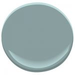
Bathroom: Sea Star (Benjamin Moore 2123-30) – A warmer blue/green that gives off the feeling of a relaxing vacation.
Master Bedroom: Stormy Monday (Benjamin Moore 2112-50) – A warm gray that’s not too light and not too dark. A perfect master retreat color that pairs easily with almost any bedspread.

Although grays are still trending, we’re seeing a movement towards taupe’s and warmer greens/blues. 2016 was full of cooler grays and bold punches of color, and as we move into 2017 we settle into a warmer and more mysterious palette.
I can’t wait to start incorporating my top picks into our 2017 designs. Stay tuned for photos of these colors in action. Comment below to let me know what your favorites are!